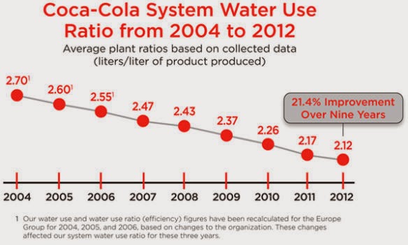
I found a bad graph. Coca-Cola is doing some good stuff. For example, they are trying to reduce the amount of water they use to create their cola. Back in 2004 they used 2.7 litres of water to make one litre of pop. But they have now gone down to almost 2.1 litres of water to make a single litre of pop. That’s great. And they hope to drop further.
But the graph they used on the press release was specifically designed to leave the impression that the drop in water usage was larger than it was. This is a well known technique where the graph ‘skips’ some values and ‘stretches’ the difference between the top number and the bottom number. Here is the chart that Coca-Cola gave:

This looks like a massive decrease. It goes from the very top of the chart at 2.7 to the very bottom, which is just below 2.1. Notice that anything below 2 litres/litre would fall off the graph all together. While Coca-Cola has done some great work to get their water-use ration down by almost 0.6 litres/litre, this is really only a descrease of 21.4%. 21.4% actually looks like this:

It is far less impressive if you don’t break the axis. Again, Coca-Cola is doing much better at conserving water. And they committed to doing better. They should be applauded, and encouraged. I point this out only for media literacy. When looking at a graph like this you need to really be aware of how someone may be trying to mislead you. There are ways to change how a chart looks to emphasize or deemphasize how different one thing is from another. Here they were trying to stretch out the difference. If you are comparing yourself to competitors you may want to do the opposite.
Here are more examples:
For more examples, this page shows how to do these charts with a broken axis properly, and in a way that is more obvious to the reader. (Except for using a log scale, which many people wouldn’t understand.) And here is a page that shows you things you can do in Excel to clearly use these techniques (but make it clear to the reader what you are doing).